ShopDreamUp AI ArtDreamUp
Deviation Actions


Suggested Deviants


Suggested Collections


You Might Like…


Featured in Groups


Description
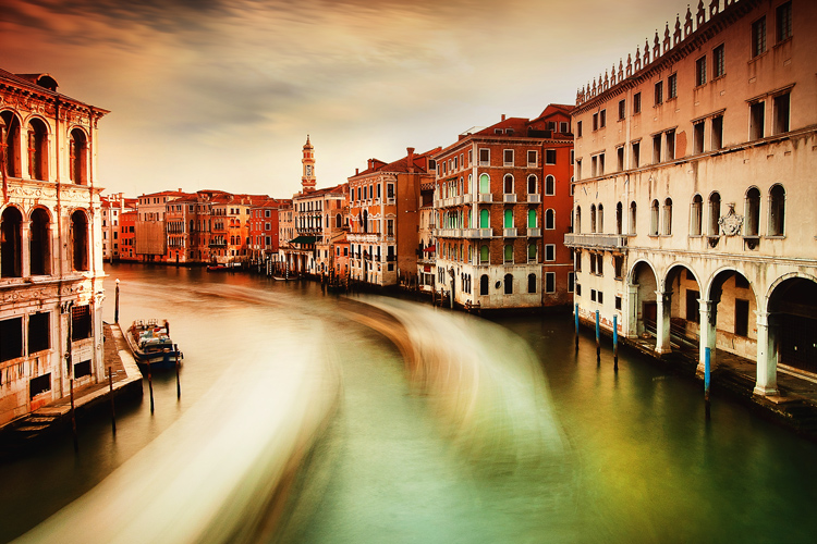
Venice, Italy 2012
More on: SSquared Photography
Follow us on FACEBOOK:SSquared Studio
and TWITTER:@SSquaredStudio
Check it out! SSQUARED WEB DESIGN
More from SSquared Photography!


More on: SSquared Photography
Follow us on FACEBOOK:SSquared Studio
and TWITTER:@SSquaredStudio
Check it out! SSQUARED WEB DESIGN
More from SSquared Photography!
Image size
750x500px 265.13 KB
© 2013 - 2024 Ssquared-Photography
Comments94
Join the community to add your comment. Already a deviant? Log In
First off great picture, good setting.
What a beautiful place !
I love the effect with the boats !
Though the orange is a bit orange a tat dark witch kind of attracts all of the attention.
Other then that i wouldn't know what to say then what a wonderful picture !
i like the fact that there is one boat that isn't moving which is kind of a contrast in the picture it seems to in a way even out the fact that the others are moving.
Sometimes you will see pictures like this where everything seems to be moving because there is nothing standing still clearly next to it or close to it.
Overall i think this is an awesome picture i wish it was a little bit lighter just a tat though, i love the boats that seems to move really fast and that there is one standing still.
The houses look great to.
Love it !